
TYPOGRAPHIC VOICE
- Jan 30, 2023
- 10 min read
“Type is saying things to us all the time. Typefaces express a mood, an atmosphere. They give words a certain coloring.” ― Rick Poynor
WHAT IS TYPOGRAPHY?
Typography is the art and technique of arranging type to make written language legible, readable and appealing when displayed.
TYPE Vs TYPOGRAPHY
The term type is used generally to mean letters and other characters assembled into pages for printing or other means of reproduction. Typography refers to the rules and conventions that govern the assembling—or composition—of type into aesthetically appealing and legible pages.

FIND YOUR TYPE
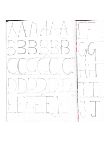
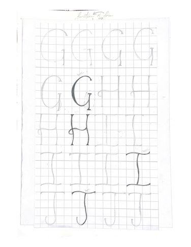
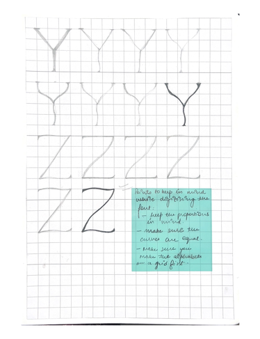
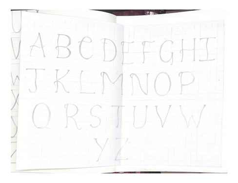
The objective for this assignment was to Build an appreciation and patience for the art of drawing letterforms.
We were initially asked to draw typefaces that represent our personality.
I started with drawing some of them in my journal and then carried it forward to A-3 size sheets.


Further, I started to fair out some of them in bigger size.


LEARNINGS AND REFLECTIONS:
The complications and minute details of a typeface is what makes it cut above the rest.
While drawing out a typeface, one needs to be very particular about it's properties.
I found out I was more comfortable with poster colours instead of drawing ink.
Initially I was making a lot of mistakes because I wasn't doing it with enough focus.
My hands were shaking a lot initially, so the edges came out to very jaggery.
I wasn't taking enough time to complete one composition and that was completely evident in my work. But with time and patience, I was able to achieve the desired outcome.
DIVING IN TYPE
Researching on a wordmark...

I realised that how much role a typeface plays in a logo. I realised the difference between SERIF and SANS SERIF and the role they play in a logo.
KODAK initially used serif typeface but it further wanted to be recognised as a friendly and fun loving brand so it used a SANS SERIF typeface.

TYPE IN ENVIRONMENT
In this assignment we had to Explore and Study typography around us in different spaces. I took tour around my locality and came up with some amazing type explorations.

Further we had to choose one of these images and recreate the whole composition paying emphasis on the type.
After discussing with faculty, I finalised this composition :

I went ahead with this composition because this seemed really interesting and colour coordinated to me.
Further, the brief was to recreate this composition but with different word, so I began with iterating words that could replace the word BINGO and also could do justice to the composition.
This process wasn’t that easy as it seems to be, but with peer discussion and faculty guidance I could come up with some options, such as follows:-

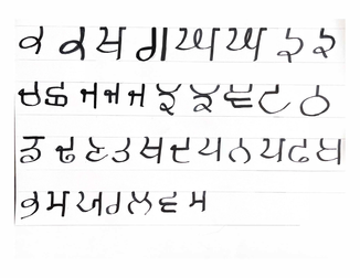
I went forward with a punjabi word BALLE, which is often used to express a joyous feeling, and means 'hooray' or 'hurrah' !
Then I started to work on the forms of alphabets, as we weren’t supposed to look at the original typeface.

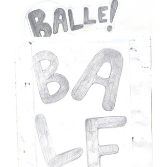


After achieving the right formations and proportions, I used the same in the composition.
I begun with making 2D prototypes initially. I made the same in black and white and coloured versions.


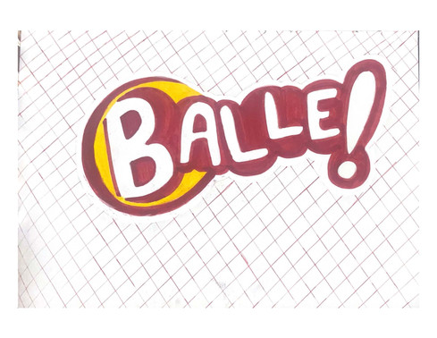
For 3D and the final composition, I used the diamond (barfi) mesh and foam sheets of similar colours that were there in the composition.
Sourcing the mesh was really tough, as it was not available in the same texture and size easily, but somehow I managed to do so, and then I spray painted it with red colour. Then using the foam sheet, I started making the whole word layer by layer and was later able to achieve the outcome.

LEARNINGS AND REFLECTIONS
I was so proud of this outcome because it really taught me to enjoy the process whether it was clicking pictures or cutting the mesh, I enjoyed each and every part of it.
While replicating the typeface, one needs to practice all alphabets of the typeface because it would help one make the outcome better.
The faculty really appreciated my process and dedication towards this assignment.
My peers gave me a feedback that the word bingo immediately striked their mind when they saw the composition and that really made me feel very happy.
FILM TYPE POSTER
In this assignment, we initially watched AGUIRRE, THE WRATH OF GOD, written and directed by Werner Herzog.
We were asked to make a film type poster taking forward a dialogue of the movie.


I chose the dialogue- TRY HIM AND THEN KILL HIM from the movie, and then made further iterations for the same.


Following are some of the iterations I did for the background :


I made one of the iteration on a bigger size too but the faculty suggested me some changes and advised to work on the poster digitally now.

Then, I started to work on the background, the iterations for background were as follows.


Working on the final poster:


FINAL MOVIE TYPE POSTER :


LEARNINGS AND REFLECTIONS
Continuous iterating helped me to reach the final outcome.
A movie poster should reflect it's theme through it's poster.
It is essential to pick out a dialogue that has some significant meaning otherwise the poster would make no sense.
The poster should be legible enough from a distance.
Multiple fonts should not be used because it won't create a visual hierarchy.
There should be some illustrative elements in the poster to create a visual balance between type and graphics.
TYPE ICONIC POSTER
For this assignment, we had to design an A3 size Informative poster for one Iconic Typeface.
The aim of the assignment was Learning about the famous typefaces throughout the history.
For this assignment, I chose FUTURA because it was considered as the typeface of today and tomorrow.
ITERATIONS FOR THE FINAL POSTER
Following are the iterations for the placement of the poster.


I went ahead with the circular composition because the placement was better in the same, also this particular placement highlighted all the weights of the typeface.
Further, adding all the details in the poster.


LEARNINGS AND REFLECTIONS
Initial research is equally important as much as the final outcome.
One should try out different placements and proportions before making a final poster.
The poster should be able to reflect what the typeface really means.
It should justify font's personality.
It should also tell how the font really looks like.
Too many colours should not be used in the poster as then it would not allow the viewer to draw proper attention to some elements.
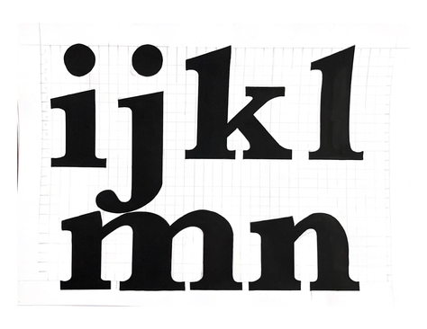
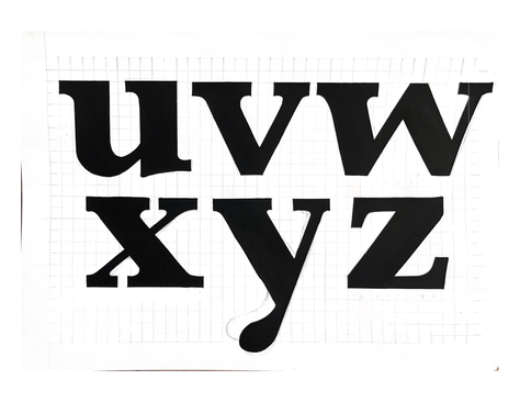
GRID CONSTRUCTION
In this assignment we had to Understand the use of grids in Type design.
I chose Baskerville as a typeface to do this assignment.
Baskerville is a serif typeface designed in the 1750s by John Baskerville (1706–1775) in Birmingham, England, and cut into metal by punchcutter John Handy.
Key features of Baskerville are its E where the bottom arm projects further than the upper, a W with no centre serif, and in the lower-case g where the bottom loop is open. Some fonts cut for Baskerville have an 'R' with a straight leg; in others it is curved. Many characters have clear ball terminals, in contrast to the more wedge-shaped serifs of earlier fonts. Most distinctive is the italic, in which the J has a centre-bar and many other italic capitals have flourishes, the 'p' has a tail pointing downwards and to the left (similar to the entrance stroke that would be made with a pen) and the w has a clear centre loop and swash on the left. In general, Baskerville's type has been described as 'rounder, more sharply cut' than its predecessors.


LEARNINGS AND REFLECTIONS
One should initially work on the grids with utmost patience. It should have equal proportions.
One should clearly know the. properties of a typeface before making it on the grid.
Initially, drawing out the alphabets with pencil helps one to have a proper framework for inking.
Outlining the alphabet reduces the chance for ink smudging and will further lead to overall neatness.
ANATOMY OF TYPE
The brief was to write any word and mark the anatomy of type.

CALLIGRAPHY
The week 2 was concluded with the amazing calligraphy workshop organised by our mentors. I've been practicing calligraphy for the last 4 years so this had to be my favourite part of the project.


LEARNINGS AND REFLECTIONS
When it comes to calligraphy one should make sure that he or she experiments to the best level possible.
Different tools help one achieve different results.
One should try out different tools to experience the variety calligraphy offers.
Writing out different scripts was the favourite part of this assignment.
There's a beauty in each and every stroke of calligraphy and one should learn to embrace it.
The main objective of this assignment was to experience the feeling of getting out of comfort zone.
EXPRESSIVE TYPE COMPOSITION
The brief for this assignment was to create a expressive poster using calligraphy as a tool.
When I had to think what I had to write on the poster, I was really confused but then I remembered the quote that I truly believe. WHAT GOES AROUND IS WHAT COMES AROUND.
The circular composition really helped me to express the true meaning of the quote.

TYPE AS FORM AND SPACE
For this assignment we had to select one typeface from each of the different categories and select one character in that typeface.
The typefaces that I selected were :
Serif- BODONI
Sans-serif - EXTATICA
Script- ALLONGES
We had to zoom into the different parts of the typeface to observe the negative and positive space in that particular composition.


We had to further create a poster as the final outcome for this task.


TYPE USING MATERIAL
In this assignment we were expected to use different materials and create either alphabets, quotations , words etc. from them. I tried a variety of materials and was able to achieve a decent outcome.


LIGHT, SHADOW AND TYPOGRAPHY
Used paper cups, made stencils for different alphabets, used flashlight to reflect the shadow on wall.

From glue sticks to bubble wrap, I used a variety of materials and achieved the following learnings :
Different materials possess different qualities and the the type behaves differently with each of them.
I tried different techniques like macrame while performing this assignment and it was really fun.
I never used bubble wrap other than packaging but it was good to know about the alternate use of the same.
SHAPE TYPE
The brief was to sketch out missing letters of the word based on existing characteristics ( Latin script ). The objective was to improve the Observation Skills and Build an appreciation and Patience for drawing Type.


LEARNINGS AND REFLECTIONS
Shaping type wasn't as easy as it looks like, it is something one needs to observe when one is seeing type anywhere around them.
While working on the ADHESION sheet, I initially observed the alphabets that were already there in the sheet bit still I feel even after observing it to the best of my capabilities I couldn't match the exact typeface.
While working on the OKAY INSPECTOR GADGET sheet, we were supposed to complete the remaining halves of the alphabets, and this also came out with a lot of mistakes. I messed up the 'G' because it didn't match the weight of the entire sheet.
This assignment really improved my observation skills and allowed to understand different typefaces.
TYPE COOKER
The brief for this assignment was to create different typefaces from different recipes.

Here, the brief for HONEY was to achieve a type that is :
Minimum Contrast
Uppercase
Plain Weight
Straight Stroke endings
Normal Width
No Serifs
Similarly, for ENJOY it was :
Ascenders and Descenders should be longer than usual
Low contrast
Slightly concave stems
Extra Condensed Width
Lower Case
Bracketed Serif Stroke endings
Another type cooker assignment,

LEARNINGS AND REFLECTIONS
This assignment was all about finding fun in the limitations, it actually taught me how the to create something out of the limitations
It taught me to how to observe the different properties of a typeface.
Looking at fonts that possess the similar qualities can make this assignment a lot more easier.
Keeping in mind all the limitations at the same time was something that was really challenging for this assignments.
Creating iterations before hand will help one achieve the desired outcome.
EXPLORING THE GRID
The brief was to experiment with different kind of grids and create different typefaces on them.


LEARNINGS AND REFLECTIONS
Different grids possess different behaviour when it comes to type.
I really liked working on the circular grid sheet as it was something I tried for the very first time and found it really interesting.
Sketching out with pencil before inking reduces chances for mistakes.
Not all alphabets go with every grid, maybe one can consider the words that would really do justice to the grid.
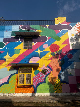
FINAL PROJECT FIELD WORK
For initiating the final outcome, I visited the Lodhi art district and was really fascinated by all the walls. The idea was to select one wall and get inspired from it to create a typeface.
This was actually very difficult because all of the walls were way to pretty and choosing one out of them was really tough.
Following were some of the pictures I clicked at the Lodhi Art District:


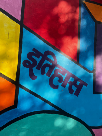


INSPIRATION FOR THE FINAL TYPEFACE

I finalised this image as my inspiration for the final typeface because this was a very interesting composition for me.
The different patterns and stroke weights really fascinated me in this composition.
This composition allwed me to create multiple iterations for the final typeface.
FINAL PROJECT EXECUTION
MOOD BOARD
The mood board was created keeping in mind the final typeface, I majorly wanted to focus on the stencils that have been created by the artist so that I could reflect the same in my final typeface.

The forms and patterns that were there on this wall helped to come up with my final outcome.
The mood board acted as an amazing tool for my inspiration because it didn't let me loose the essence of the typeface.
ITERATING ON FINAL TYPEFACE
Initially, I started with listing the keywords for my typeface, and started making ietrations with reference to my mood board.

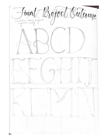


Initially, I was making mistake in the form, I then thought I do not want any straight lines in my typeface. I made sure all the alphabets have curves in them and no straight lines.
I made sure all the curves are equal and proportionate. To achieve the equal proportions, I was advised to make the typeface on a bigger grid.

After making the typeface on grid, I didn't really give much thought to it and went ahead on digitising the same.
DIGITAL OUTCOME
After seeing my typeface on screen, I didn't like it at all. I was really not happy with the outcome. I thought of taking feedback from my faculty to move ahead in this project.

Faculty pointed out some mistakes in my proportions and also they pointed out the irregular endings. This was something I was also very doubtful of.
I then decided to revisit my whole process, I started with looking at my mood board once again, Obviously I left some stones unturned and this time I had to make sure I cover all the required steps.
I decided to take inspiration from my mood board once again, this time I was only considering the inspiration for endings.

I really liked this part of the picture I took, so I took inspiration for endings from this particular part.
I then decided to take inspiration form the drop shaped leaves ending.
I tried top incorporate the same in my typeface .
I started the process again by iterating in my journal.


When I took feedback on this attempt, it was really a good one.
My faculty and my peers really appreciated my efforts. The only area where I had to improve was the stroke quality and proportions.
As was I was abiding by the whole process, I didn't wanted to skip the making of a font on a large size grid.
This time I was pretty sure of the few things :
Using poster colours to ink it.
The bigger the better, I made sure the alphabets are in the largest size possible because literally wanted to cover the whole graph paper.

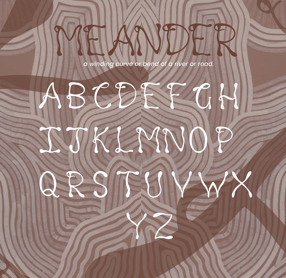
DIGITISING THE FONT


NAMING OF THE FONT
Initially, I was quite confused when it came down to naming the font. I went ahead with keeping the name MEANDER.
A meander is one of a series of regular sinuous curves in the channel of a river or other watercourse.
APPLICATIONS OF TYPEFACE


LEARNINGS AND REFLECTIONS
One should have a clear brief when it comes down to creating a typeface.
Abiding by the process helps one to know where he or she has made the mistake.
A large amount of emphasis should be given on the proportions as they allow one to reduce the changes of irregularity.
The typeface should be made with considering it's further usage.
One should make enough mockups for the typeface so that it is easy for the viewer to know the typeface's personality.
“Typefaces are to the written word what different dialects are to different languages.”
― Steven Heller


Comments