Website Design ( UI/UX)
- Dec 10, 2023
- 7 min read
Updated: Dec 11, 2023
I read this quote somewhere "People will scroll if they have a reason to do it" and since then it got stuck in my head.
.
On the very first day of the project we were briefed that to carry forward this academic project we'll have to take a live ( industry based ) project .
.
As the first step in our project, we were tasked with creating an inspiration wall to kickstart our creative process. This wall should be a compilation of elements and inspirations that resonate with us, drawn from a wide range of digital sources, including websites, Android and iOS apps, and any other online platforms.
For this assignment, each of us ( since it was a group project ) will showcase one carefully selected example from the digital landscape. It can be in the form of an image or a direct demonstration of a website or app. During our presentation, we had to explain what captivates us about our chosen example and the reasons behind its inspiration.
The website that I took to move forward in this project was https://www.anthropologie.com/anthroliving/?ref=logo .
.
Personally, I find Anthropologie living's website very aesthetic and extremely neat. But as people always say UI/ UX of a website can never be perfect so I thought this website would be a great option for me to explore the loopholes the website carries.
After analysing each and every page, these were some of my observations :
.
REFLECTIONS :
Effective Use of Visual Elements
Interactive Features
Intuitive Navigation
Enhancing User Engagement
Value of Loyalty Programs
Subtle Background Opacity
Responsive and Mobile-Friendly Design
Balancing Aesthetics with Functionality
Suggestions for Improvement
Overall Takeaway
Afterwards, our journey initiated with a pivotal step – the selection of a live client. This decision set the stage for a dynamic and engaging project experience.
So, we had 4 options for a client-:
A plant nursery
A commerce society of Kirorimal College, Delhi University website
A fashion studio
A dessert cafe
We initially discussed the above mentioned 4 options ourselves then we discussed the same with our faculty as well:
After the feedback and discussion, we finalised to work on the website for The commerce Society of Kirorimal College, Delhi University named COMSOC.
Following was the on-boarding message that we received from the our client, APOORV ARORA, the visionary president of the society!
Hey guys!
Thanks for considering ComSoc KMC for your live project.
To give a brief about us, we are a dynamic community of individuals representing the Department of Commerce of Kirori Mal College, University of Delhi. Working relentlessly to ignite the intellectual curiosity of students and encouraging them to take initiative, we organise various events, speaker sessions and workshops for the same purpose. Check out what we do and how we do it at instagram.com/comsockmc/
To tell you about what we expect, PFB some links for your reference-
- Ideal website = https://dstreetsrcc.com/
- Our website under construction - https://comsockmc.wixsite.com/my-site
- Our old website - https://comsockmc.wixsite.com/comsockmc
Kindly refer to the first link to get an idea of what our vision for the website looks like.
With that being said, would be glad to collaborate with you guys and provide with all kinds of support you would need for your live project.
Thanks & Regards!
JOURNAL NOTES
MEET THE CLIENT

To begin with the workflow, the very first step was to IDEATE & RESEARCH :
We started with research on the various websites with similar usage
We then singled out ideas/ elements that we liked about these sites
Further, we created a MOOD BOARD or INSPIRATION WALL of all the singled out ideas.
MOODBOARD FOR THE WEBSITE

Within our MOODBOARD, we incorporated the colour scheme, the typography, the animations, user interface and flow, various interactions etc. which we wanted in our website as well.
Later, listing down the aim for the project helped us to recognise our client's basic need and vision for the website:

Further, we decided to list down the milestones we have to achieve through out the making of this website with reference to our client's vision and goals :
After understanding the client's vision we mutually agreed upon the deliverables and our scope of work for this project.

This helped us to make a proper to do list which further allowed us to make the project timeline:

But obviously, we couldn't follow the timeline unless we have a proper research backup.
Further, we had to make a problem statement which further told us about the challenges that our client was facing.

By reviewing the problem statement, we analysed that what really needs to be done.

It was extremely essential to know about the PROJECT BACKGROUND, where the client told us about how actively their society is working and also the challenges they are facing without the website.
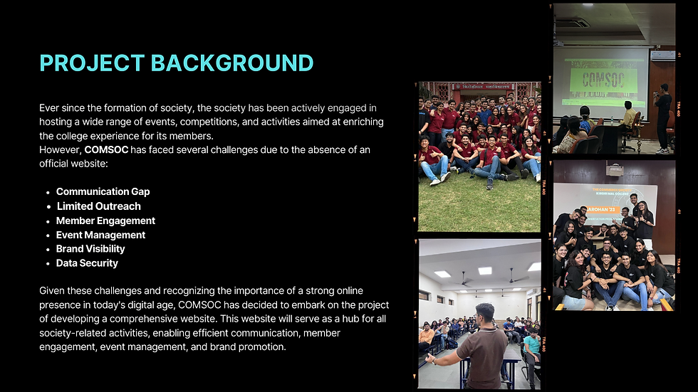
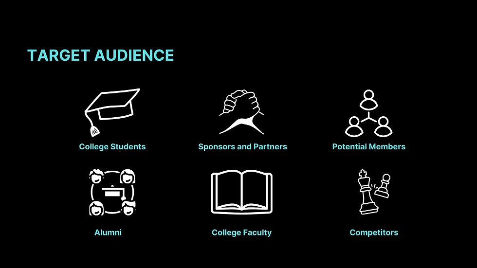
To further move ahead in the project, we discussed the TARGET AUDIENCE for the website with our client, which is mentioned below :
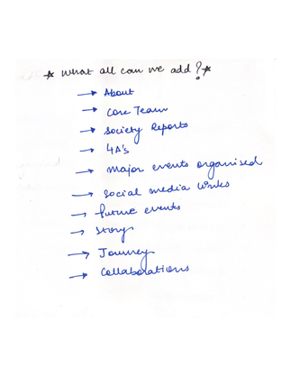
After several meetings and discussions with our client, we finalised on to the features that we want in our website. We suggested a lot of features to the client but the following were taken in consideration for the website:
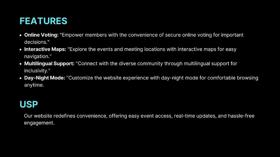
USP is something that helped us to differentiate our website from the various existing websites.
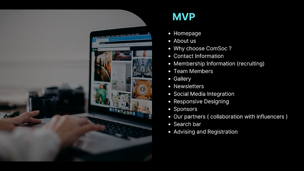
MVP, also known as minimum viable product, helped us to analyse what are our must haves for the website. We realised while the making of the website that is one step turned out to be extremely helpful yet an amazing feedforward.
SWOT ANALYSIS, it is something that always gives meaning to the complete research. This step was appraised by our client and also helped him to know the position of the website.

MOSCOW, which helped us learn about the must haves, should haves, could haves and the would haves , kind of made a checklist for us. We knew from this where we had to start...

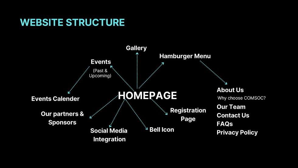
Talking about the start and not mentioning about the homepage would definitely be a big mistake. So to begin with the website structure, we started with the elements that we need in the homepage:

TONE AND MESSAGE
The tone of a website refers to the emotional or stylistic quality of the content and design. It sets the overall mood and atmosphere of the website and influences how users perceive and engage with the content. //
The message of a website encompasses the core information, ideas, and communication goals it seeks to convey to its audience. This is the primary content that the website aims to deliver.

Before the website project began, our client faced several significant pain points in their digital presence. These challenges included a lack of online visibility, limited reach to their target audience, and an absence of an efficient platform to communicate their services and values. Additionally, the client struggled with inadequate engagement and interaction with potential customers. These pain points hindered their ability to establish a strong online presence and effectively convey their message and offerings to the digital landscape.

Conducting a competitive analysis before the initiation of the website project was a crucial step in understanding the client's position within their industry.
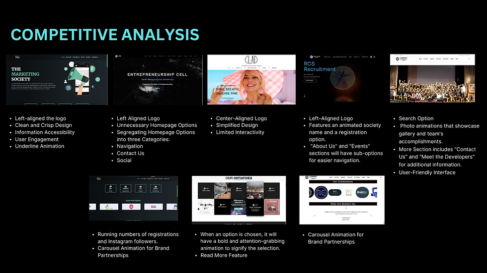


Further, we made a questionnaire in which we highlighted the questions we wanted different society members and college students to answer...//

Following were the responses we received :
The data gathered from this questionnaire played a pivotal role in shaping the website's design, content, and overall user experience. It ensured that the website would be tailored to meet the precise needs and expectations of the client's audience, creating a more engaging and effective digital presence.
BRAND IDENTITY
As we embarked on the journey of creating a dynamic and impactful website for our client, an important aspect of our project was the development of a strong brand identity. This identity would serve as the foundation upon which the entire website design and messaging would be built.

This was something that we did in the first week of the project, the feedback that we received on our research presentation was :
Great team effort, highly impressed by the amount of research!
Amazing understanding of client's requirements. Create task analysis to ease the user flow.
Detailed research, divide the tasks to make this a success!
With the given research and feedback we carried forward the beginning of the second week by starting our LOW-FI WIREFRAMES or SKETCHES.
So the learning that I carried from the previous UI/UX Project was that sketching is extremely essential in terms of UI/UX Design!
Sketching helps one identify the elements one needs in respective screens. It helps to identify the user flow as well.
They offer a clear and uncluttered view of the layout and structure of the interface, making it easier for both designers and stakeholders to visualize the end product.
To begin somewhere, we initially thought that all of us should make 4-5 iterations for the homepage :
This really helped us to have multiple perspectives towards home page. This approach helped us to come up with the must haves of our home page and explore different layouts as well.
HOME PAGE SKETCHES
After, finalising the layout for the homepage, we further divided different website pages amongst ourselves.
To have a clear understanding of different website pages, we started with of a sitemap :
A sitemap is a visual or hierarchical representation of a website's structure, outlining the arrangement of pages and their interconnections. It serves as a roadmap for both designers and search engines, enhancing navigation and accessibility.
SKETCHES
LOW FI WIREFRAMES ( INDIVIDUAL )
Translating conceptual ideas into rough sketches to visualize the layout.
By initiating our design process with low-fi wireframes, we lay a solid foundation for the subsequent stages. This methodical approach allows for efficient collaboration and a seamless transition into the development of high-fidelity prototypes, ensuring the ultimate success of our UI/UX design endeavors.
LOW FI WIREFRAMES (GROUP)
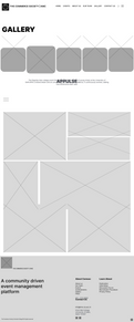
MID FI WIREFRAMES
PROCESS :
Transitioning from low-fi to mid-fi wireframes allows us to bridge the gap between conceptualization and the concrete manifestation of the design. This phase sets the stage for further refinement, ensuring that the subsequent high-fidelity prototypes are well-informed and aligned with the project's objectives.
HIGH FI WIREFRAMES
PROCESS :
The UI-centric phase brings the envisioned user interface to life, bringing us one step closer to the realization of a seamless and visually compelling user experience.
PAGES DESIGNED BY ME :
PROTOTYPING
Link of the prototyped website : https://www.figma.com/proto/NGoprhCgXl3JqaPNWwN7vg/COMSOC-KMC-WEBSITE-(Copy)?page-id=0%3A1&node-id=59-10783&starting-point-node-id=59%3A9913&scaling=scale-down-width&mode=design&t=aD4ZutwsOG68nOc3-1
Link to miro board :
LEARNINGS AND REFLECTIONS
Understanding the target audience's needs, preferences, and behaviors is integral to creating a website that truly resonates.
UI/UX is a collaborative process and one must perform all the steps with utmost patience.
Each feedback loop, usability test, and iteration brings the design closer to its optimal state, ensuring it evolves with user needs and expectations.
A willingness to iterate ensures the final product is resilient and aligned with goals.
Engaging stakeholders, clients, and potential users at various stages fosters a collaborative environment. Their diverse perspectives enrich the design process and contribute to a well-rounded final product.
"Design is not just about making things beautiful; it's about making things work beautifully." - Unknown






Comments