UI UX DESIGN
- May 2, 2023
- 6 min read
Updated: Oct 5, 2023
User interface and User Experience
“A user interface is like a joke. If you have to explain it, it’s not that good.”
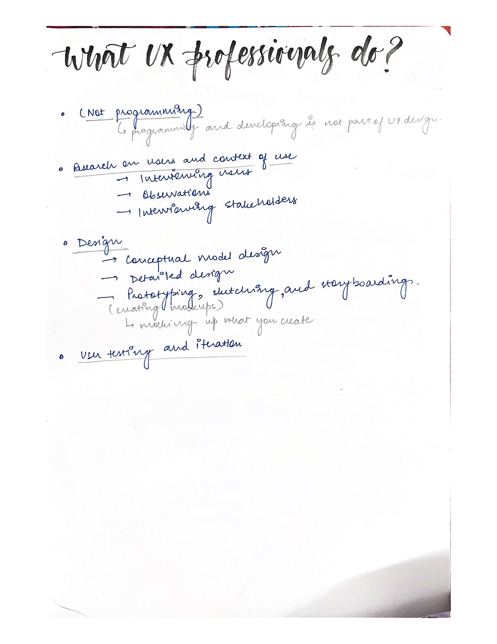
User Experience includes all the aspects of the interaction between the end user with the company, it's services and it's products.
It is about designing instructions, which helps the user completing their task easily.


LOCK SCREEN STUDY
Our first assignment was all about LOCK SCREENS.
The brief was to compare different lock screens of different devices and people and one should be of our own.
I started this assignment by asking different people for screenshots of their lock screens.
Following were the lock screens I collected:


After collecting the same, I realised that I've collected a great variety of lock screens and I was really looking forward to it’s comparative analysis.
Along with comparative analysis, we also had to do the user persona to understand the user behaviour with reference to their respective device's lock screen.
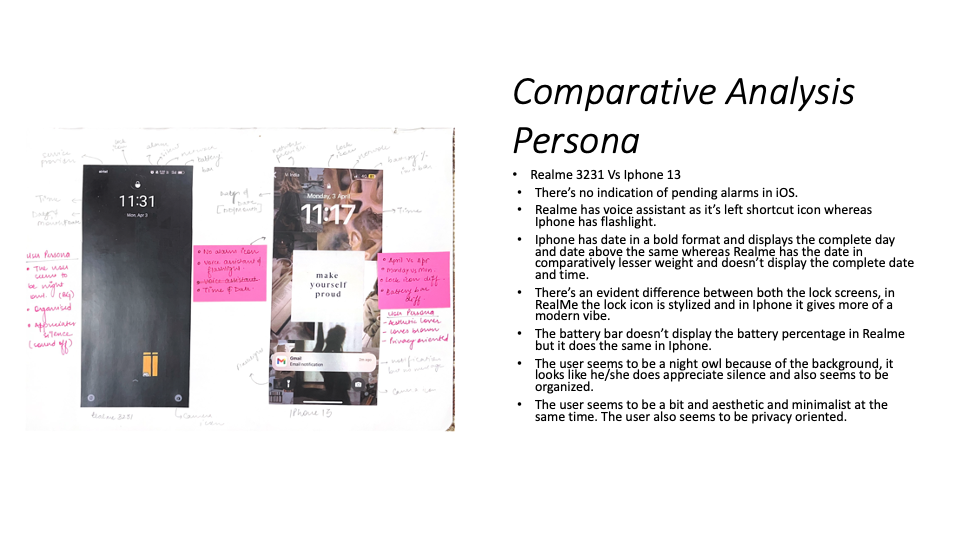


After analysing all the lock screens, the brief was to list down the differences and similarities.

The process of analysing was not easy but it was surely very insightful. The brief was then to create own version of the same and take feedback from people.


After finalising the features and elements that I want in the lock screen, I went ahead in order to create the digitised versions.


LEARNINGS AND REFLECTIONS
This task helped me to look at the minute details.
It helped me judge people's personalities through their lock screens.
It helped me analyse a brand's personality through their lock screen.
How different icons symbolises different brand is what I got to know with this assignment.
It helped me to know different preferences of different people when it comes to lock screen.
The digitisation of lock screens helped me analyse the size of icons and placement of different elements in a lock screen.
DECODING AND REDESIGNING MOBILE APPLICATION
Brief : Choose one mobile application to deconstruct, and after learning about the application, redesign the same with some new perspective.
The aim of this assignment was to understand how different layers of information and usability is designed.
The app that I chose to move forward in this assignment was SPOTIFY.
Initially, I began with researching about SPOTIFY in terms of branding to know it's Tone of Voice.

I chose Spotify because I am a music lover and there's not even a single day that I spend without using Spotify, so I felt that I know it's interface in and out.
Further, the brief was to do screen by screen analysis of at-least 5-6 screens which ultimately completes one task flow.
TASK FLOW- Create a Playlist.
SCREEN BY SCREEN ANALYSIS
The brief was to decode the elements and list down all the functions/Features available on these screens.


The screen by screen analysis really helped me to figure out how I wanted to optimise the screens to make it more accessible and appealing for the users.
LOW FI PROTOTYPES
After analysing, I started working on the LOW FI PROTOTYPES
Low-fidelity wireframes are basic wireframes that outline blueprints for web pages or app screens. They help you communicate your product's “big idea” rather than the specific details.


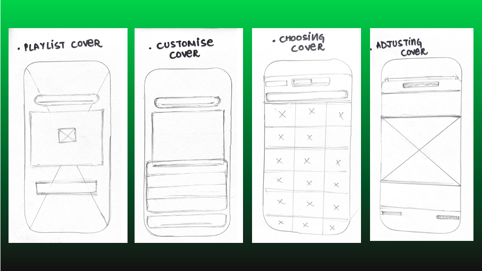

After working on the low fidelity wireframes, the next step was to create MID FI PROTOTYPES.
A medium fidelity prototype is a prototype with limited functionality but clickable areas which presents the interactions and navigation possibilities of an application. Medium fidelity prototypes are usually built upon storyboards or user scenarios. Through these prototypes plots can be more easily presented.


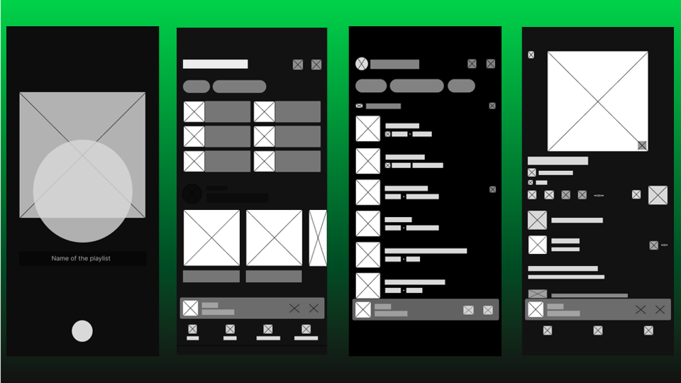
The mid fi prototypes act as a foundation for high fi prototypes, A lot of thought about the proportions and placements went behind creating the same.
HIGH FI PROTOTYPES
A high-fidelity wireframe is a more complete visual representation of the framework. It has more technical detail, and it’s usually clickable and responsive to user actions. This gives designers a feel for how the final design will work for real users, making it helpful for user testing.


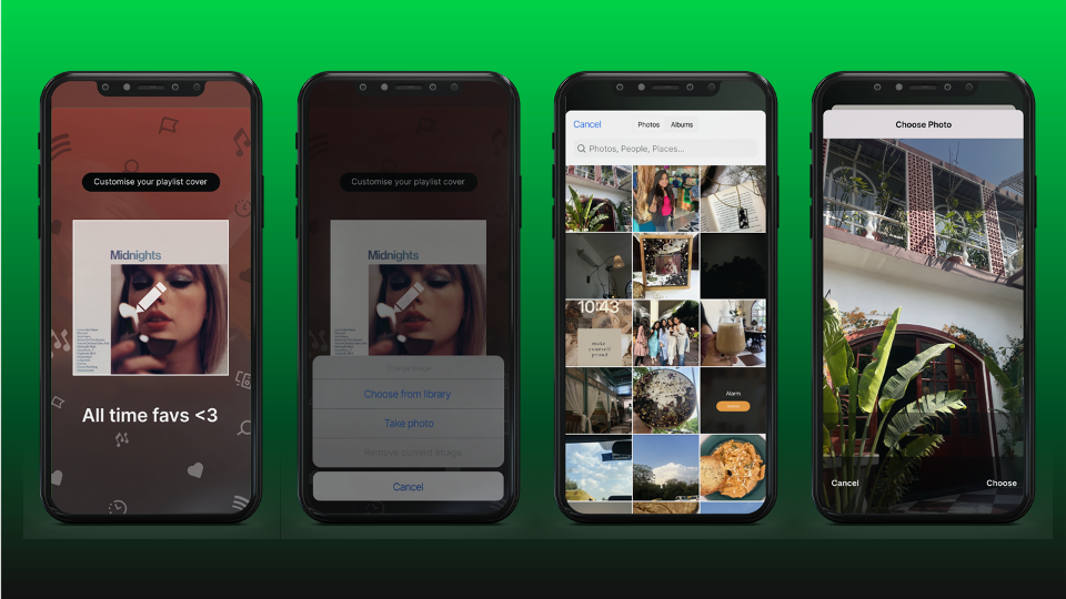

The biggest realisation of this task was each frame and each screen has something to optimise. The features that one add with reference to redesigning an app should be logical enough so that too many features do not complicate the user.
LEARNINGS AND REFLECTIONS
Naming each element and layer in figma leads to no confusion.
Each app follows a user journey, one needs to understand it in order to redesign it.
User feedback is extremely important in order to know the app inside out.
Focus on the little things as they are something that needs to grab the most attention of a UI/ UX designer.
CREATE YOUR OWN APP

The brief was to create a mobile app for an educational institute.
Initially, we had to create a group of 5.
GROUP : Gaurvi , Parri, Bhavika, Astha and Vrinda.
Initially, we had to decide the purpose of our app and it didn't took us much time to come down to STATIONERY.
We felt the need for this app because stationery in our college doesn’t work in much organised manner. In order to improve the same, we had certain ideas in our mind but obviously that couldn’t be executed without proper research and feedback.
Before even thinking the features of an app, we had to sit with our team members and research on the various apps with similar usage.
We started researching on existing stationery apps like :
Scooboo
Stationery Yug
Inch Paper
Just Kraft
Topperskit
We decided to take one app each and research on the features it offers.
I started working on INCH PAPER, and following were my takeaways:

We then started to single out ideas/ elements that we liked about these apps.
Further, we had to create a MOOD BOARD or an INSPIRATION WALL of all the singled out ideas and pin them up on our working stations.

NAMING OF APP :


We then prepared questionnaire that would further help us back up our research :


We then had to come up with the concept of our app and list down the features we wanted in the same:


Further, we had to define our target group or audience:

USP of the App
An app that makes stationery buying experience convenient

PEN PORTRAITS

USER STORIES


MOSCOW
MOSCOW stands for :
Must have:
Cannot deliver on target date without this
Not legal without it
Unsafe without it
Cannot deliver the Business Case without it
Should have:
Important but not vital
May be painful to leave out, but the solution is still viable
Could have
Wanted or desirable but less important
Less impact if left out (compared with a Should Have)
Wont have this time
Wanted or desirable but less important
Less impact if left out (compared with a Should Have)

WIRE FRAMING OF SCREENS
Initially, we started to sketch out the home screen because it is something that would eventually help to plan out the complete flow of an app.

We made multiple iterations for the same, it allowed us to explore different placements and features.
We collated all the ideas, and finalised the below:

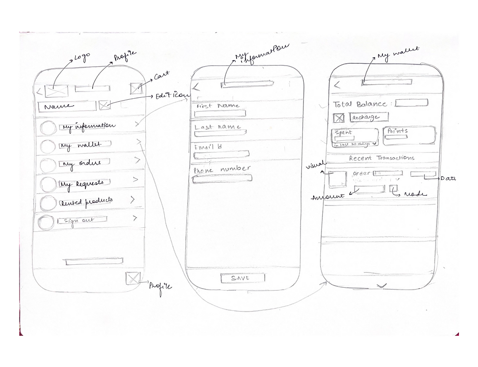
We then divided different task flows amongst ourselves and made the low fi wireframes.


LOW FI WIREFRAMES MADE BY ME
TASK FLOW :
PROFILE SECTION from the home screen0-


MID FI WIREFRAMES
After completing the low fi wireframes, we took faculty feedback and the faculty advised us to move ahead and make mid fi wireframes.
While making the mid fi wireframes, following points had to be kept in mind :
Naming of wireframes
Proper proportions of each and every element
Spacing and outer padding
Enough breathing space
Accurate labelling of elements
Sizing of icons and visuals

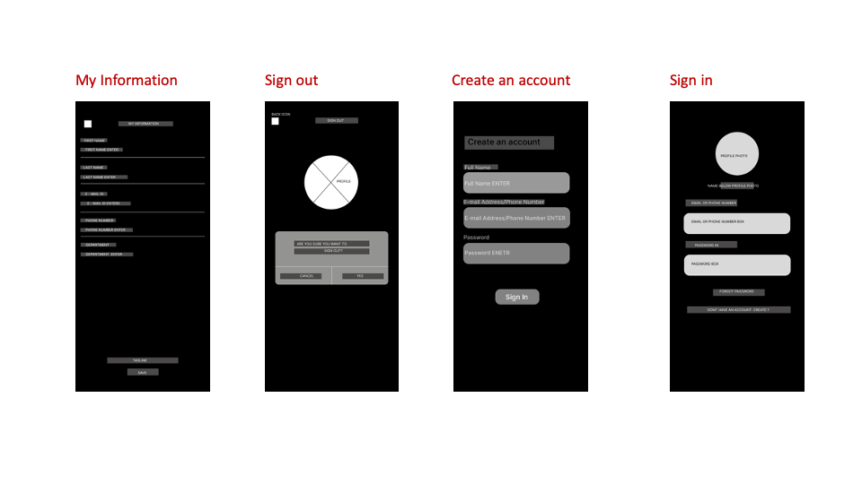


When we completed the above wireframes, faculty gave us a heads up to not waste more and start the UI as soon as possible. There were still some gaps which we had to rectify, but we thought that we can cover the same while doing UI.
HI-FI WIREFRAMES


Above were the final UI frames we made for the final presentation.
PROTOTYPING
Prototyping for the app was done by me.
Initially, I felt very confused but then with utmost focus I was able to do the same.
It took a lot of time but with patience it happened.

Figma File link :
FEEDBACK
UI can be worked upon, but according to first time our efforts were much appreciated.
Faculty really appreciated the prototyping we did for the app.
They pointed certain gaps in the sizing of icons, which we fixed further.
The app is very neat and completely serves the purpose of a stationery app.
TEACHINGS AND REFLECTIONS
We were told in the first class of this project that UI UX is all about the user and I realised the same by the end of it.
UI/ UX is a collaborative process and it is almost impossible without user feedback and take aways.
One needs to be extremely focused when it comes to prototyping because it is a very tedious task.
One should not feel shy while asking questions from users, ask as many as possible as far as they are relevant to the topic.
Proper labelling will eventually help one make a proper working prototype.
“Everything is designed. Few things are designed well.”


Comments